공부한 내용
- 데이터 시각화
- matplotlib 라이브러리 사용
- seaborn 라이브러리 사용
- 데이터프레임 & 시리즈로 그래프 그리기
- seaborn 라이브러리로 그래프 스타일 설정
- matplotlib 라이브러리
1. 전체 그래프가 위치할 기본 틀 만들기
2. 그래프를 그려 넣을 그래프 격자 만들기
3. 그런 다음 격자에 그래프를 하나씩 추가. 격자에 그래프가 추가되는 순서는 왼쪽에서 오른쪽 방향
4. 만약 격자의 첫 번째 행이 꽉 차면 두번째 행에 그래프를 그려 넣는다.
<anscombe 데이터를 이용하여 그래프 그리기>
import seaborn as sns
anscombe = sns.load_dataset("anscombe")
print(anscombe)
print(type(anscombe))
%matplotlib notebook
import matplotlib.pyplot as plt
dataset_2 = anscombe[anscombe['dataset'] == 'II']
dataset_3 = anscombe[anscombe['dataset'] == 'III']
dataset_4 = anscombe[anscombe['dataset'] == 'IV']
fig = plt.figure( ) # 그래프 격자가 위치할 기본 틀
axes1 = fig.add_subplot(2, 2, 1)
axes2 = fig.add_subplot(2, 2, 2)
axes3 = fig.add_subplot(2, 2, 3)
axes4 = fig.add_subplot(2, 2, 4)
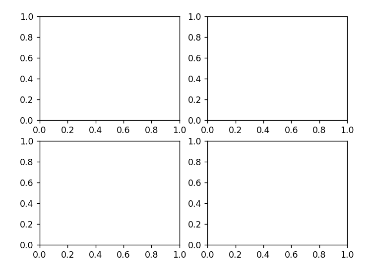
axes1.plot(dataset_1['x'], dataset_1['y'], 'o')
axes2.plot(dataset_2['x'], dataset_2['y'], 'o')
axes3.plot(dataset_3['x'], dataset_3['y'], 'o')
axes4.plot(dataset_4['x'], dataset_4['y'], 'o')

- seaborn 라이브러리
import seaborn as sns
tips = sns.load_dataset("tips")
ax = plt.subplots()
ax = sns.distplot(tips['total_bill'])
ax.set_title('Total Bill Historam with Density Plot')

-> 밀집도 그래프를 제외하고 싶다면 kde=False,
밀집도 그래프만 나타내고 싶다면 (히스토그램만) hist=False
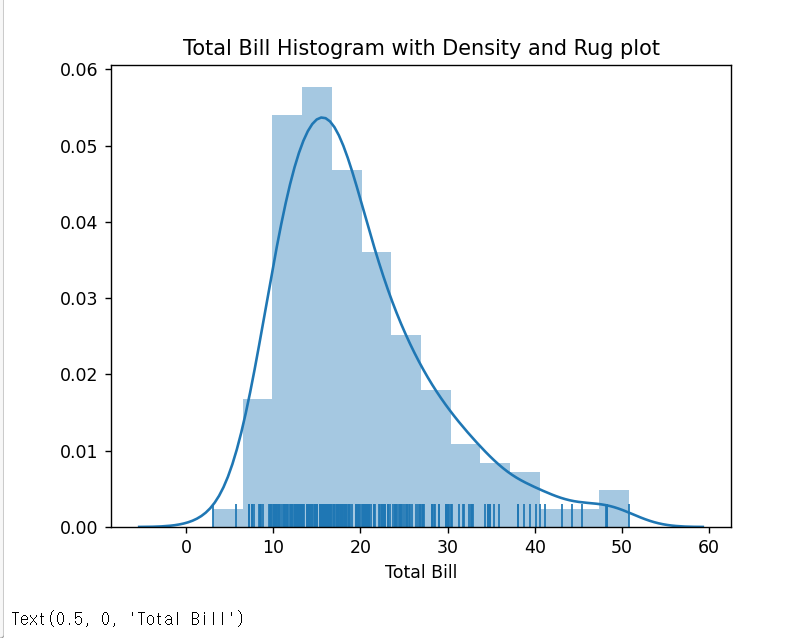
+ 양탄자 그래프 추가 : 그래프의 축에 동일한 길이의 직선을 붙여 데이터의 밀집 정도를 표현한 그래프
ax = plt.subplots()
ax = sns.distplot(tips['total_bill'], rug=True)
ax.set_title('Total Bill Histogram with Density and Rug plot')
ax.set_xlabel('Total Bill')
# 산점도 그래프
ax = plt.subplots( )
ax = sns.regplot(x='total_bill', y='tip', data=tips)
ax.set_title('Scatterplot of Total Bill and Tip')
ax.set_xlabel('Total Bill')
ax.set_ylabel('Tip')

+ 만약 회귀선을 제거하려면 fit_reg=False
ax = sns.regplot(x='total_bill', y='tip', data=tips, fit_reg=False)
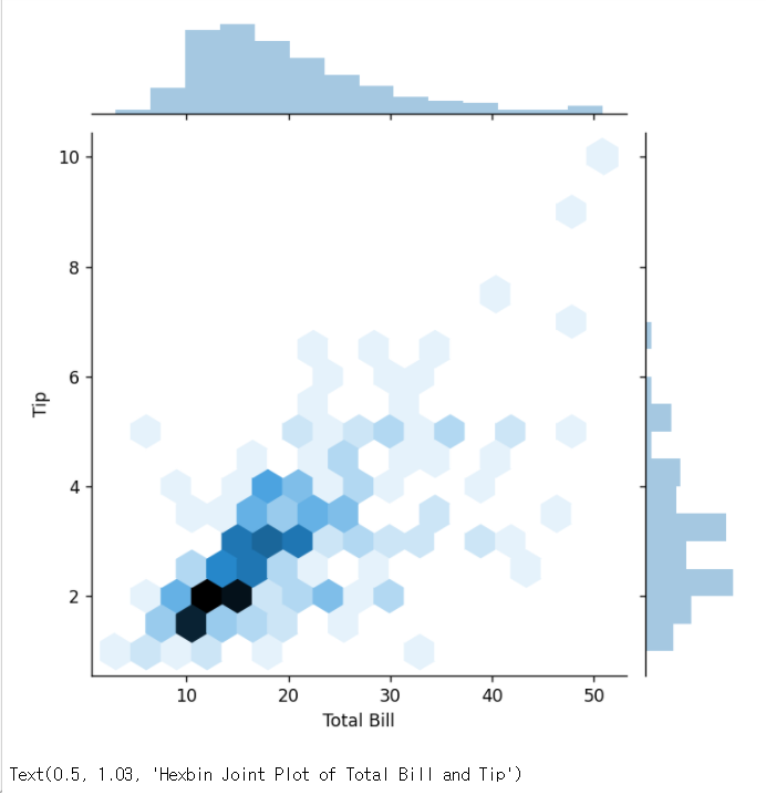
# 육각그래프(hexbin)
hexbin = sns.jointplot(x="total_bill", y="tip", data=tips, kind="hex")
hexbin.set_axis_labels(xlabel='Total Bill', ylabel='Tip')
hexbin.fig.suptitle('Hexbin Joint Plot of Total Bill and Tip', fontsize=10, y=1.03)
# 이차원 밀집도
ax = plt.subplots( )
ax = sns.kdeplot(data=tips['total_bill'], data2=tips['tip'], shade=True) -> 그래프에 음영 효과
ax.set_title('Kernel Density Plot of Total Bill and Tip')
ax.set_xlabel('Total Bill')
ax.set_ylabel('Tip')

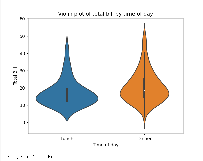
# 바이올린 그래프
# 박스 그래프가 데이터 분석에 모호하게 표현될 경우, 박스 그래프에 커널 밀도를 추정한 바이올린 그래프를 사용함!
ax = plt.subplots()
ax = sns.violinplot(x='time', y='total_bill', data=tips)
ax.set_title('Violin plot of total bill by time of day')
ax.set_xlabel('Time of day')
ax.set_ylabel('Total Bill')
# 데이터프레임 & 시리즈로 그래프 그리기
ax = plt.subplots( )
ax = tips['total_bill'].plot.hist( )

fig, ax = plt.subplots( )
ax = tips.plot.box(ax=ax)

참고) 데이터시각화 공부
seaborn documentation
seaborn: statistical data visualization — seaborn 0.11.1 documentation (pydata.org)
seaborn: statistical data visualization — seaborn 0.11.1 documentation
Seaborn is a Python data visualization library based on matplotlib. It provides a high-level interface for drawing attractive and informative statistical graphics. For a brief introduction to the ideas behind the library, you can read the introductory note
seaborn.pydata.org
matplotlib documentation
Matplotlib: Python plotting — Matplotlib 3.3.3 documentation
Matplotlib: Python plotting — Matplotlib 3.3.3 documentation
matplotlib.org
'Python > python_pandas 입문 [책]' 카테고리의 다른 글
| [python_pandas 입문] 공부 # 6일차 (0) | 2021.01.20 |
|---|---|
| [python_pandas 입문] 공부 # 5일차 (0) | 2021.01.18 |
| [python_pandas 입문] 공부 # 4일차 (0) | 2021.01.15 |
| [python_pandas 입문] 공부 # 2일차 (0) | 2021.01.09 |
| [python_pandas 입문] 공부 # 1일차 (0) | 2021.01.08 |


댓글